The January Issue: Mauve
+ New Year's advice from Vreeland and the art of the shopping bag
Happy New Year Luxe Libris readers!
I hope your 2023 came to a shimmering or quiet close (whichever you needed) and that your 2024 is off to as gentle a start as possible. I spent the holidays at home with my family in Cambridge, Massachusetts, watching screwballs and doing jigsaw puzzles with rosemary gimlets close at hand, which is just what I needed.
I’m grateful to Rhiannon K, Lauren Cerand, and Allison Escoto for agreeing to be featured in the February, April, and August 2023 issues respectively. The other months I suppose I was distracted with things like traveling internationally for the first time in years and taking long gossipy walks around my neighborhood with an older woman who lives in my building. A few 2023 highlights for me included my first-ever courier trip for the library (in this case, delivering Nabokov manuscripts to a remote museum in rural Switzerland), exploring English country houses for fifteen blissful days in July, and hosting a working women-themed book club with a friend at a local bookshop. In other words, 2023 provided many opportunities for putting on An Outfit.
I don’t have a feature interview this month, though I am excited for a few I have on the horizon. Meanwhile, here are some thoughts on the color mauve and the typical sundry.
Mauve! At the Sargent Show
For the next week or so, Bostonians and visitors can still see the exhibition Fashioned by Sargent at the Museum of Fine Arts featuring over fifty portraits by John Singer Sargent and a dozen original garments worn by his glamorous Gilded Age sitters. The show explores Sargent’s relationship to fashion, unpacking how the portraitist often styled his sitters by directing them on what to wear and inventing garments whole cloth. (He once quipped in a letter to a friend that he was “in the thick of dress making and painting.”) I have some reservations about the exhibition’s execution, which have been more expertly explored by Kathleen Stone and Peter Walsh in this two-part Arts Fuse review. But there’s no question that the show is dazzling. As curator Erica Hirschler explains in this exhibition video, “the sitters don’t survive; some of the clothes do. So this is one of the few chances to see what Sargent saw and to see how he saw it.”
In his Arts Fuse review, Walsh heralds the Paris dressmaker House of Worth as the “sidebar star” of the show. For me, this honorific goes to the color mauve.
Consider this portrait of Mary Frances Hammersley:
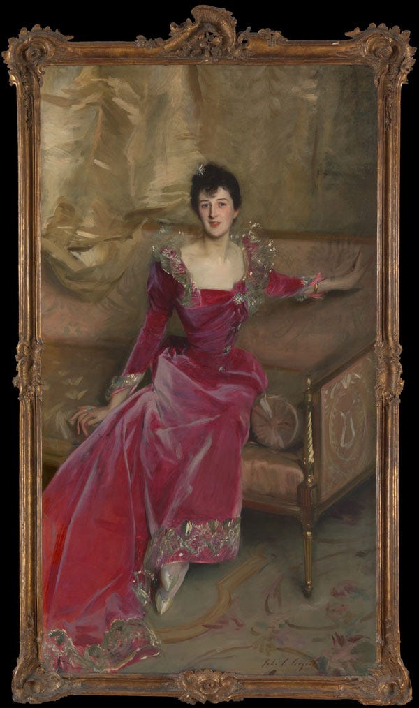
As you stand in front of her, the intensity of her velvet dress sends a zing! up your spine. The other portraits in the gallery quietly sparkle; Mrs. Hammersley sparks—this is portraiture as pyrotechnics. And it’s all down to the color of the dress. Near the portrait the exhibition displays a swatch of the original dress with an accompanying exhibit label explaining that the fabric is silk velvet and dyed with “a combination of natural (cochineal) and aniline (mauvine) dyes.” Ordinarily, this might be the sort of statement we glaze over in a label. In fact, this particular combination of dyes tells a story that unlocks the secret of this portrait’s success.
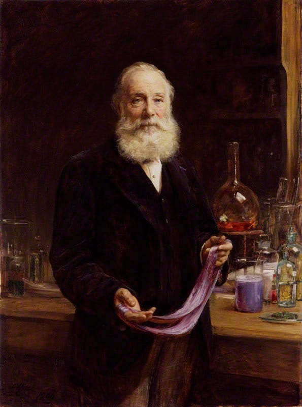
Mauvine—or mauve, as we know it—is a miracle: it is the world’s first artificial color, accidentally invented by the English chemist William Henry Perkin in 1856, just a few decades before Mrs. Hammersley sat for her portrait. Perkin had been tinkering with coal tar in hopes of finding a treatment for malaria and instead created (in his words) a “strangely beautiful” purple residue that adhered well to silk. From there, many more aniline dyes were patented, giving the world new synthetic colors such as fucshine (the origin of fuchsia and magenta), roseine, aniline blue, and aniline black. But none set off such a craze as mauve.
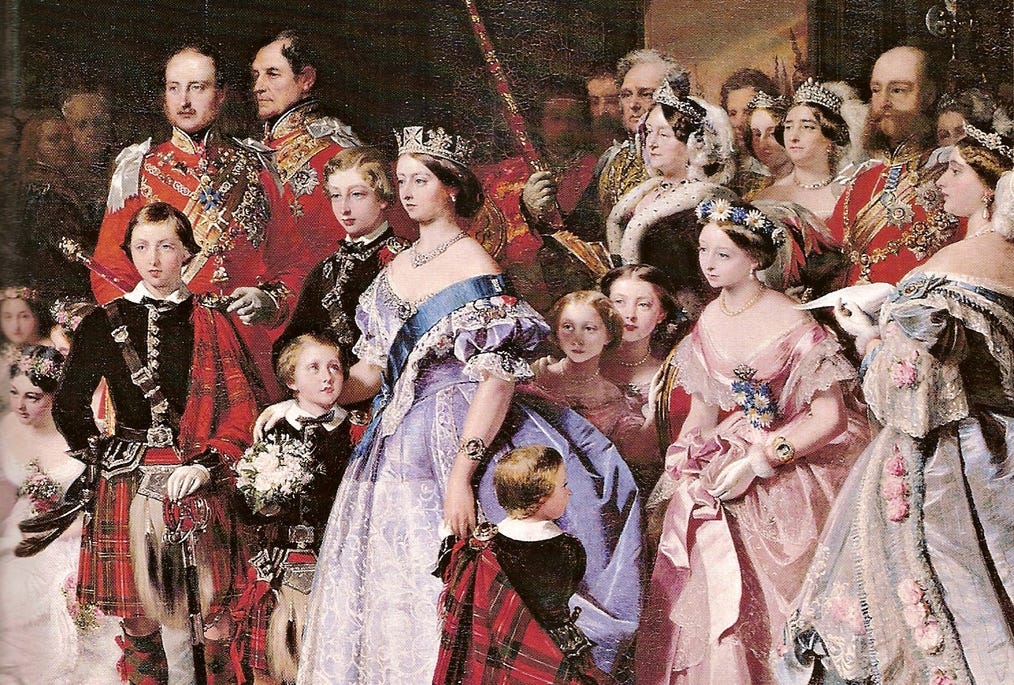
Before Perkin’s invention, textiles were dyed from natural sources such as plants or insects, which could be expensive to obtain in large quantities, labor-intensive to extract, and inconsistent in application. Cochineal dye, used in Mrs. Hammersley’s dress and likely giving it its rosy red hue, is a natural dye derived from the cochineal insect found in North and South America. According to Brittney Miller writing in Knowable Magazine, it takes roughly 70,000 insects to make one pound of cochineal dye. By contrast, “Perkin’s Purple” was affordable, easy to produce and reliably intense and so, became an instant sensation. Despite its low cost, women from across the social spectrum sought it; in 1858, Queen Victoria wore a mauve gown to her daughter’s wedding:
In the twentieth century, synthetic dyes would become ubiquitous, but in the 1890s, when Mrs. Hammersley sat for her portrait, wearing new artificial colors was a high-wire act—if not pulled off with tact, your garment might be judged as too bold or gaudy. According to James Finch’s essay on this painting for the MFA’s exhibition catalog, the portrait has two saving graces: the garment’s combination of a natural hue mixed with a synthetic one, the total effect of which one critic described as “red mauve, only one shade removed from something aniline and terrible, but that shade all-important,”1 and the tasteful design of the dress, especially its lace trimming. In other words, the natural dye, cut, and ornamentation of the dress roots Mrs. Hammersley—the wife of a British banker—in tradition, while the introduction of mauve projects her into the future.
Though divisive at the time, this portrait garnered Sargent approbation from the London and French critics who mattered. Then, the painting may have owed its success to the softening effect of the cochineal dye. Today, as your eye roves over the dress, it practically vibrates, setting it apart from the other portraits in the show. This is unquestionably indebted to the mauvine dye.
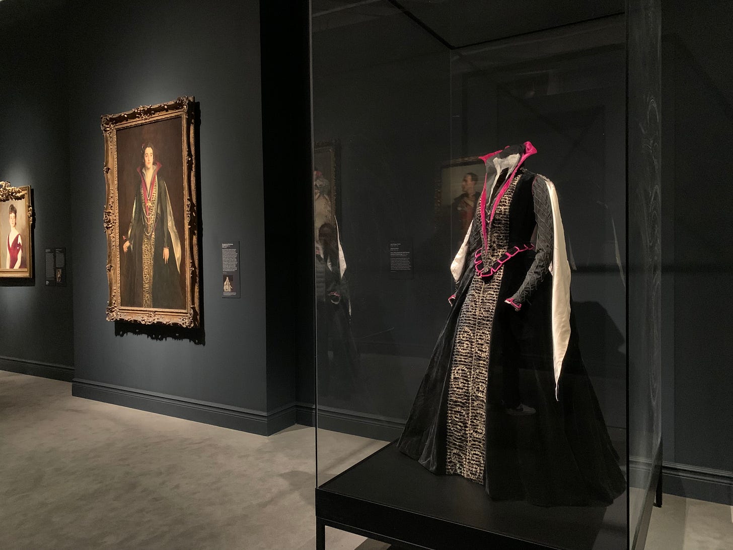
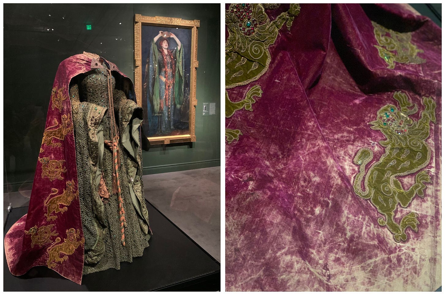
There are a few other garments in the show that, while I can’t confirm, I suspect benefited from mauve and its aniline variations including:
This House of Worth fancy-dress costume for Sybil Sassoon Countess of Rocksavage, 1922:
This cloak for Lady Macbeth’s “Beetle Wing Dress” worn by actor Ellen Terry, 1889:
And the garments that appear in these paintings:

Because this is Luxe Libris, I can’t close this meditation on mauve without mentioning the enormous implications aniline dye had for duplication. Thanks to its highly transferable properties, multiple copies can be made from masters typed or written in aniline ink. This gave the world its first copying technology called the hectograph and, later, ditto machines (which look like mimeographs, but use a wax and solvent-based copying process that actually gives off the strong scent some people incorrectly associate with mimeo). If this all sounds like a lot of steampunk jargon, let me put this another way: aniline dye gave us clandestinely copied versions of Tolstoy’s censored Kreutzer Sonata and early circulated versions of Allen Ginsberg’s “Howl.” The technology is also used widely today by tattoo artists to transfer the basic outline of a tattoo design to a person’s skin.
For further reading on the color mauve, Sargent, and duplication, I recommend and am indebted to these works:
“Colors/Mauve: Disappointment and Opportunity” by Shelley Jackson for Cabinet Magazine, Winter 2007–2008
Mauve: How One Man Invented a Color that Changed the World by Simon Garfield, W.W. Norton, 2001
Fashioned by Sargent by Erica E. Hirshler, with Caroline Corbeau-Parsons, James Finch, and Pamela A. Parmal, Museum of Fine Arts, 2023
“‘A Crying Tint of Rose’: Fashion in Sargent's Mrs. Hugh Hammersley” by Jessica Regan for the Metropolitan Museum of Art, September 2015
Cheap Copies! The Obsolete Press Guide to DIY Hectography, Mimeography & Spirit Duplication by Rich Dana, 2022
WHY DON’T YOU
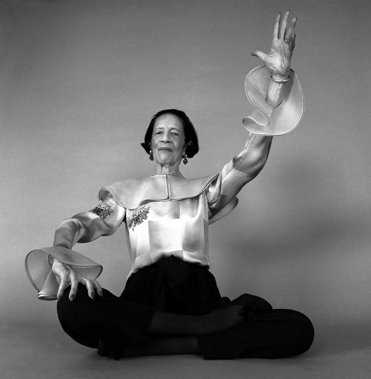
If, like me, you declined to make any New Year’s resolutions but still want to feel the excitement of trying something new (anything to stave off the doldrums of January), consider taking up one of the challenges posed by fashion editor Diana Vreeland in her Harper’s Bazaar column that ran from 1936 to 1962. All of the following are taken from her madcap “Why don’t you?” column, with one thrown in by me (guess which one), because it’s fun to try the Diana hat on.
“Why don’t you cover a big cork bulletin board in bright pink felt banded with bamboo, and pin with colored thumb-tacks all your various enthusiasms as your life varies from week to week?”
“Why don’t you tie black tulle bows on your wrists?”
“Why don’t you fill your fountain pen with a shocking ink like an electric shade of emerald?
“Why don’t you put all your dogs in bright yellow collars and leads like all the dogs in Paris?”
“Why don’t you find a pair of Victorian cuff-links and have them made into studs for the front of a pleated silk shirt?”
“Why don’t you give someone a length of exquisite brocade—enough for an evening envelope, to bind a favorite book, or make a little jacket?”
Consider the Shopping Bag
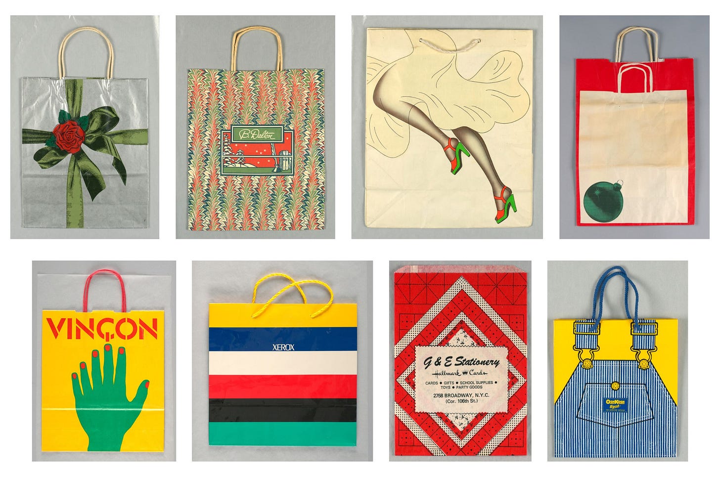
One of my favorite follows on Instagram is GQ writer and man-about-town Jason Diamond, who recently shared a carousel of old shopping bags he had stored on his phone. (Do you see what I mean?) This reminded me how much I enjoy looking through the Cooper Hewitt online catalog, which I suspected would have superlative shopping bag examples in its collection. Reader, I was not disappointed. Here is a canned search for you to explore at your leisure, but let me join Jason in offering a Whitman’s Sampler of bags I loved for one reason or another:
Sundry
I learned so much about the work of creating colors researching for this essay, and was fascinated by artist Stuart Semple’s crusade to liberate proprietary colors such as “Tiffany blue,” “Barbie pink,” and “Vantablack” by reformulating them. This Vanity Fair article covers Semple’s work to date.
One of the most wholesome corners of the internet is Jeopardy! Fashion Recap, a newsletter by former Jeopardy contestant Lily Nelson that catalogs and covers the ensembles worn by jeopardy contestants and hosts (well, now, just host). Lily has a kind word for everyone and doesn’t get bogged in brand sourcing or tie-ins. It usually takes less than a minute to read. Let Lily help you gently wade into your morning inbox.
I really want to see the Cooper Hewitt exhibition on the American textile designer Dorothy Liebes, “A Dark, A Light, A Bright” (what a title!), but I’m not sure I’ll make it to New York before the show ends in February. If you’re also feeling blue about missing it, the museum has a robust online companion website with deep dives into her life, her use of color and texture, and—my favorite—all the glamorous interiors built around her creations, such as the Waldorf Astoria’s Marco Polo club circa 1960.
I really loved this article in the Philadelphia Inquirer about a team of volunteers who mend clothing for the unhoused.
As long as there is war in Ukraine, Luxe Libris will ask readers to consider donating to ForPeace, an organization run by my friend Britta who provides local, on-the-ground humanitarian aid to Ukrainians in need.
The Times London May 1, 1893. page 10, as quoted in Fashioned by Sargent (2023) exhibition catalog essay “Mrs. Hugh Hammersley” by James Finch

Whether mauve or otherwise, Sargent's clothing is more sumptuous (to my eye) than any other painter's. Thanks for the background on mauve -- I had no idea it was artificial!
This was AMAZING! I'll definetely be reading more about it, lol. Thank you, happy 2024!